Well its been a huge week for mobile payments, centered around Apple finally throwing their hat into the ring. Looks like a lot of what I anticipated actually made it into to Apple Pay: the incorporation of Touch ID as an authentication method at the point of sale, and shortcutting the on boarding process by using any card stored in your iTunes account (augmented by OCR or image recognition scanning of any new cards that are added).
NFC is not new technology. Still, there are a handful of typical innovations that distinguish this payment experience from others than have come before.
1. Tokenization
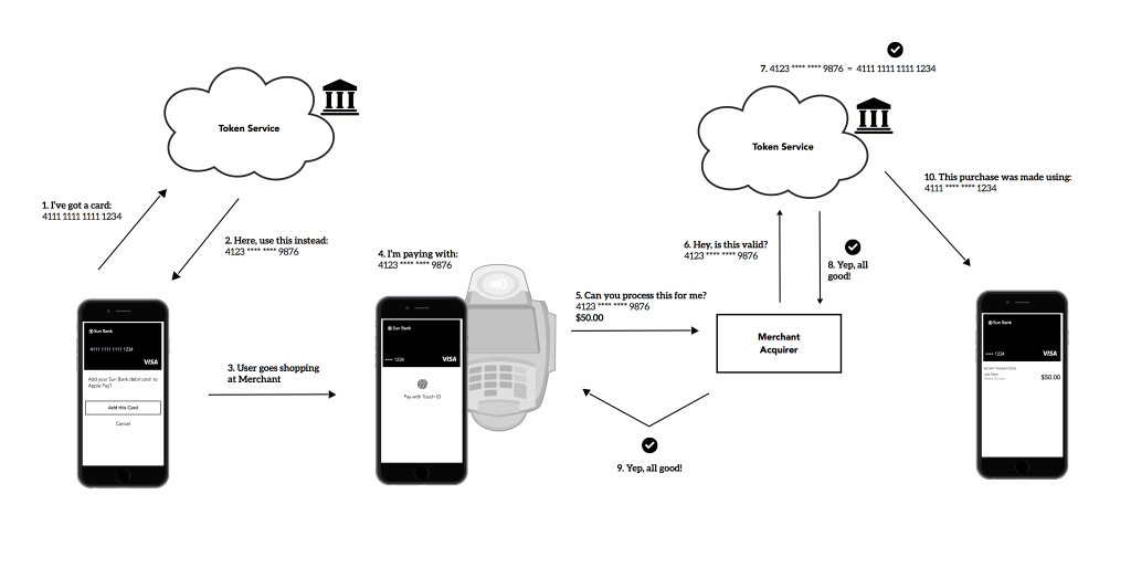
This is probably the least sexy feature, but its the most powerful in terms of security. Apple has taken a cue from the existing payment networks (Visa, MC, AmEx) to incorporate using a proxy card number at the point of sale, in the form of a token. The diagram below illustrates how this works: when Apple Pay takes in a user’s PAN (primary account number or card number) the payment network will give back a token that is stored in the secure element on the user’s iPhone, and will take the place of the actual card number at the point of sale. This is accompanied by a dynamic cryptogram that changes often, kind of like the 3 digit security code from the back of your card (or 4 digits on the front of an AmEx card).

When the user taps their phone on the reader, that token (plus the cryptogram, which again is dynamic and can expire) is passed to the merchant via NFC, and the merchant can accept it because it looks very similar to the traditional16 digit card numbers we already use. The merchant sends along this token through the payment ecosystem, where the token will be translated back into the user’s PAN and the payment will go through, all in half a second. This differs from historic NFC, in that the PAN and card data is never passed in the clear — only the token & cryptogram pass from the phone to the reader. Got it? No? Well, this blog post from Clover breaks it down a bit more, especially for developers. The end result is a more secure payment method, which will prevent cardholder data breaches like the Target and Home Depot incidents.
2. Touch ID
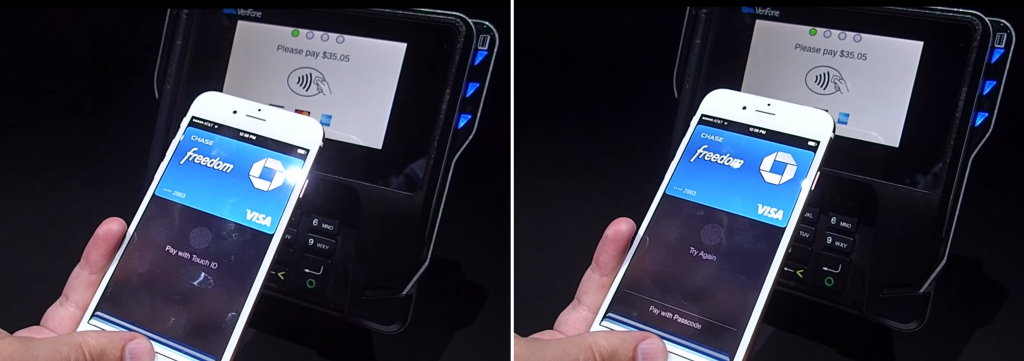
In Apple Pay, the user might tap their phone on the reader twice: once if the screen is locked to wake up Passbook and open the user’s default card, and once after the user has authorized to pay with Touch ID. If their phone is already unlocked and Passbook is open, that first tap is not necessary. This is similar to the Open & Tap method I described in Designing Mobile Payment Experiences. As usual, Apple takes special care to handle error flows with care: if the Touch ID scan doesn’t take, there appears to be an alternate method, which employs the user’s phone unlock PIN.
 3. Access
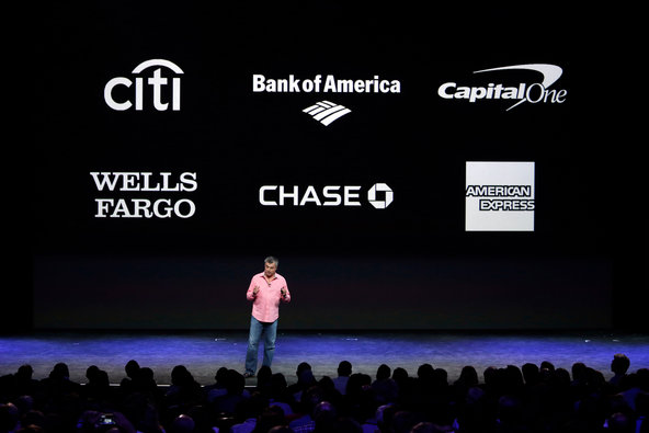
The breakthrough which will be most apparent to users with Apple Pay is the unprecedented number of banks and credit AND debit card issuers supported: American Express, Bank of America, Capital One Bank, Chase, Citi and Wells Fargo off the bat, followed by Barclaycard, Navy Federal Credit Union, PNC Bank, USAA and U.S. Bank shortly after. Compare that to Isis/Soft Card, which only has three (Chase, American Express, Wells Fargo… sometimes credit cards only). Google Wallet supports any card, but at the point of sale uses a virtual MasterCard. Most NFC wallets in Europe, South Korea and Japan are single-issuers or stored value cards. The fact that Apple Pay will support the majority cards used in the US opens up the user base significantly.

4. Comfort
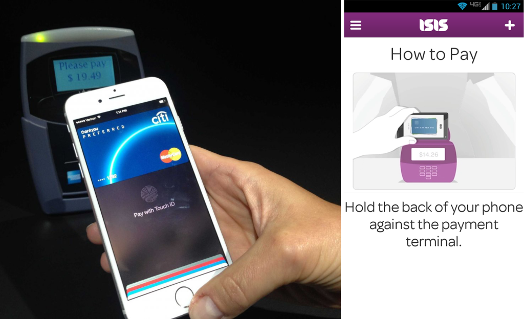
Historically, a NFC antenna would be located on the center-back of the phone. Apple has placed their’s near the top of the phone. Why does this matter? It makes presenting the phone to a reader much more natural, given how the majority of user’s hold their phones (via Steve Hoober‘s research). Again, the goal is to make tapping fast and easy. To get a consistent read with Android wallets like Google Wallet and Isis/SoftCard, the user often has to tilt their phone sideways (aka landscape mode) to fit the orientation of the contactless pads on most POS readers. This was reflected in the UI of Isis/SoftCard to that the user’s card is presenting horizontally, as well as in their tutorial diagrams (see below, right).

I’ll re-visit the Apple Pay experience once the phone comes out next week, but on face value, Apple Pay will no doubt play a huge role in how consumers use and track their day-to-day finances.

